Related

Mar 07,2024
Health, Environment and Policy Program Helps
Guide Air Quality Management in Ecuador
Calmatters
Press
/ Jul 17,2020
For nearly half a century, the deterioration of the environment and living conditions and the health effects of pollution have become important political issues. According to a study by the World Health Organization (WHO) and the University of Bath in the United Kingdom in 2016, almost 92% of the world's population is breathing polluted air [Footnote 1]. The growing concern about the effects of air pollution on human health has led many cities around the world to monitor the state of the air in order to inform their local populations about pollution risk.
There are three independent steps that are needed in order to communicate air quality information to the general public. The first step is the development of an index that transforms continuous air quality concentrations into values that provide relevant information representing either regulatory or health priorities. The second step is designing communication tools that allow the visualization of scaled index values in a format that is readily understood by the general public. The third step and final step is the formulation of a dissemination plan through which the developed communication tools can be shared with the public (e.g., publication in traditional media outlets such as radio, newspapers, and TV; development of mobile apps or APIs that can be used by third-party developers; or publication of communication tools on government and third-party websites).
Improvements in any of these three steps (index creation, designing communication tools, and dissemination planning) would be expected to result in better outcomes associated with air pollution risk communication. Here we focus exclusively on the second step by evaluating some of the communication tools that are being used around the world. Critical issues regarding communication tools are discussed including addressing local cultures in the design of communication tools, the opportunities and limitations in standardizing communication tools, and comparison of examples from North America, Europe and Asia.
The first country to communicate simple and understandable information to the public on the state of the air was the United States, which introduced the Pollution Standards Index in 1968. Now known as the Air Quality Index (AQI), this communication tool is a key part of the air quality management systems implemented by local public authorities. The purpose of an air quality index is to characterize the quality of local, urban or regional air in a simple (qualitative or numerical) and global manner. An index plays a significant role in educating and informing the public. The U.S. AQI is comprised of 6 levels, each represented by a color ranging from green for the qualifier "good" and burgundy for the qualifier "hazardous". This index can be found in various media outlets as well as on the U.S. government website Airnow.gov.
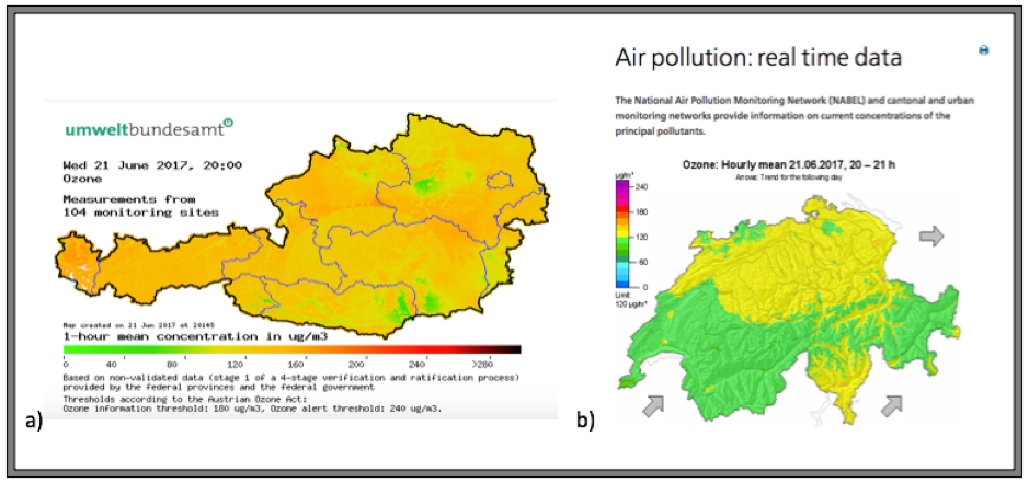
The purpose of the AQI is to combine multiple variables into a single value that can easily communicate important information to the public. As regulated by the U.S. Clean Air Act, the AQI is calculated from 5 pollutants: ground-level ozone, particle pollution (also known as particulate matter), carbon monoxide, sulfur dioxide, and nitrogen dioxide. The highest level pollutant from each day is used to determine the reported AQI level. However, other countries communicate air quality information by reporting single, raw pollutant concentrations without combining multiple pollutants into a representative index (even though an accompanying scale is often provided to assist in interpretation of these values). This is the case, for example, in Austria and in certain regions of Switzerland, which use ozone concentrations alone to define the state of the air. While these systems seek to relay air quality information to the public, they are not by common definition, true indices.
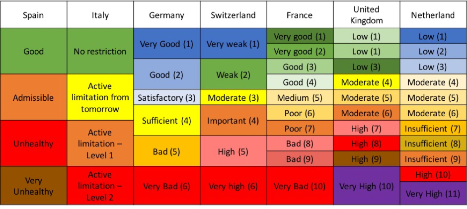
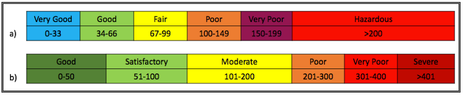
Although most countries use a color system to disseminate air quality information in a simple and understandable way, there are great differences in the choice of colors used and the number of levels in the scale. For example, in Europe, although most countries follow European legislation in terms of air quality management, 4 to 11 different levels are observed. It should be noted that the color code respects certain trends. Indeed, green and blue are mostly used to describe a situation where the risk to health is low or the air quality is good. Additionally, we may even have color differences within the same country. For example, in Martinique, an overseas region of France, the green used in the French metropolis is replaced by blue. Globally, highly polluted air is qualified with warm colors instead, such as red, brown and purple. It would seem, therefore, that the code used by the first index created in the U.S. was generally followed around the world, in spite of some nuances. Even in China where, in contrast to Western countries, red is culturally associated with positive traits, we also find this same U.S.-based color code being applied to their air quality index.
In addition to colors, which are a simple way to get a message across, the air quality index is sometimes represented by a shape or a drawing in order to make the information comprehensible to all. This principle, already used in many areas such as traffic signs and biological and chemical hazards, allows a better understanding of the message. France is one of the countries to adopt this system using the "ATMO Giraffe", which will displays a joyful attitude when the air quality is good and pained one when it is bad. Following the same principle of displaying characters with positive or negative attitudes according to the state of the air, one can find a girl for the city of Shanghai, a head in Hong Kong, smileys for the project CITEAIR of Europe, and a little man for South Korea.
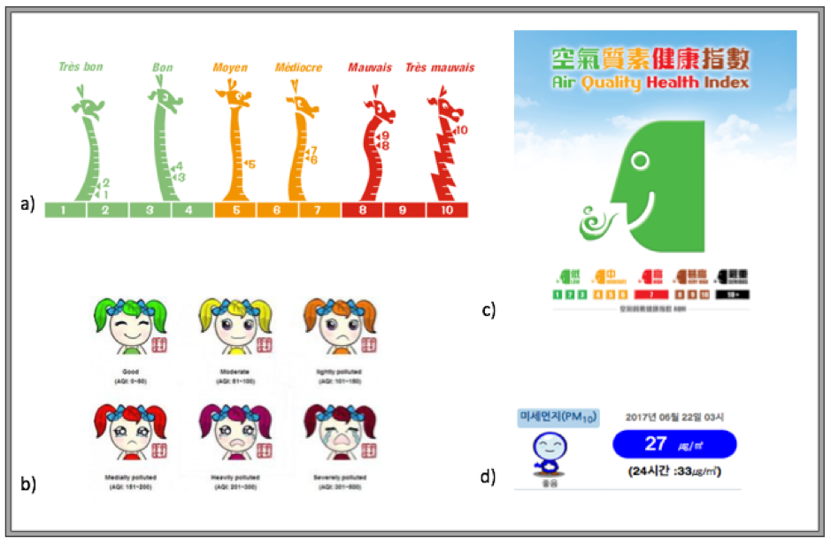
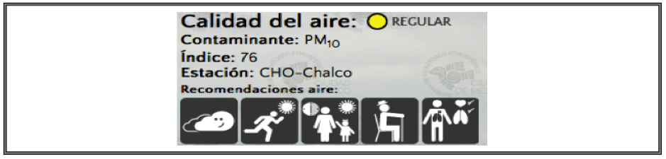
All of these drawings are intended to facilitate understanding of the index. Thus, the color in addition to the attitude of the character indicates to the population if the quality of the local air at a given time is dangerous for one’s health. Mexico, meanwhile, also uses simple drawings to warn the population of activities in harmony with the air quality and the persons concerned. For example, it is possible to see for a given day that air quality is dangerous for vulnerable populations such as asthmatics or the elderly, but also that the air is of a quality good enough that outdoor exercise is safe for the general population.
More and more associations of countries and private companies would like to harmonize all this information. In 2004, the European Union launched a program financed by Interreg (a European program to promote cooperation between European regions and the development of common solutions in the fields of urban, rural and coastal development and environmental management) to provide clear and uniform air quality information for large cities across Europe through a single website. The NGO Clean Air Asia is working on a similar global project in Asia. Despite these harmonization efforts and the commonalities found between different air quality management systems around the world, it is difficult, if not impossible, to combine this information into a functioning global index.
The example cited above concerning the differences in scales and colors in particular in Europe is a first part of this answer. If we look more closely at the information given by the indices, the color and also the numbers corresponding to these levels, we realize that the scales are not comparable. Let us take another example of India and Australia. India is one of most polluted countries in the world, while Australia is a relatively unpolluted state. In each country, the air quality index is adapted to local conditions. For example, the range corresponding to "poor" area quality in Australia corresponds to the low index of the "moderate" rating on the India’s index scale. We see here the difficulty of having a global air quality index throughout the world because the worst day in one place might be cleaner than best day in another place.
While such challenges in creating a global index may be addressed, it is important that the ultimate purpose of any air pollution index is to give the public usable information on local conditions. Indeed, indices make it possible to provide information on the air quality in a given location and time, to inform the public if the air quality today is better than that of yesterday and whether conditions are unhealthy for individuals based on their health conditions. Individuals are likely to make the best behavior changes relative to their personal risk and regional conditions if communication tools are designed with these goals in mind.
Air quality indices are a key part of air quality management systems around the world, communicating air pollution health risk information to local populations. These tools are present in many countries around the world. In order to make air quality information accessible, systems of drawings and colors are used. Similar trends are observed in all these communication tools, though differences in relative pollution levels make this information difficult to compare globally. Moreover, the communication tool itself is not sufficient if it is not widely disseminated in order to be accessible to the public. A great deal of work is currently under way to make available information on air quality more readily available to local populations in order to prevent health effects based on packages comprehensible to all through the universal language of colors and drawings and understand the differences between regions and best represent local conditions of air quality.
Please fill out the information below to receive our e-newsletter(s).
*Indicates required.